
Interactive Data Dashboard on Olympic Medal Counts
Data Analysis & Tableau Dashboard Visualization
Created as a projectdeliverable for the course Data Visualization (BANA 6037), an elective in the Lindner College of Business taken for the Master of Design Program at the University of Cincinnati College of Design, Art, Architecture, and Planning (DAAP).
This project focused on designing an interactive Tableau dashboard to communicate a clear, data-driven story about Olympic medal performance. Using an official dataset sourced from the Olympics website, the work applied business-focused data visualization principles taught in BANA 6037 and emphasized structuring information to support intuitive exploration.
The final dashboard linked multiple visual elements to reveal top medal-winning countries from the most recent Olympic cycle, demonstrating the integration of analytical methods, visual encoding decisions, and interactive storytelling.
Role
Data Analyst, Visualization Creator
Tools Used
Microsoft Excel, Tableau
Background
According to the Official 2024 Paris Olympic Games Data…
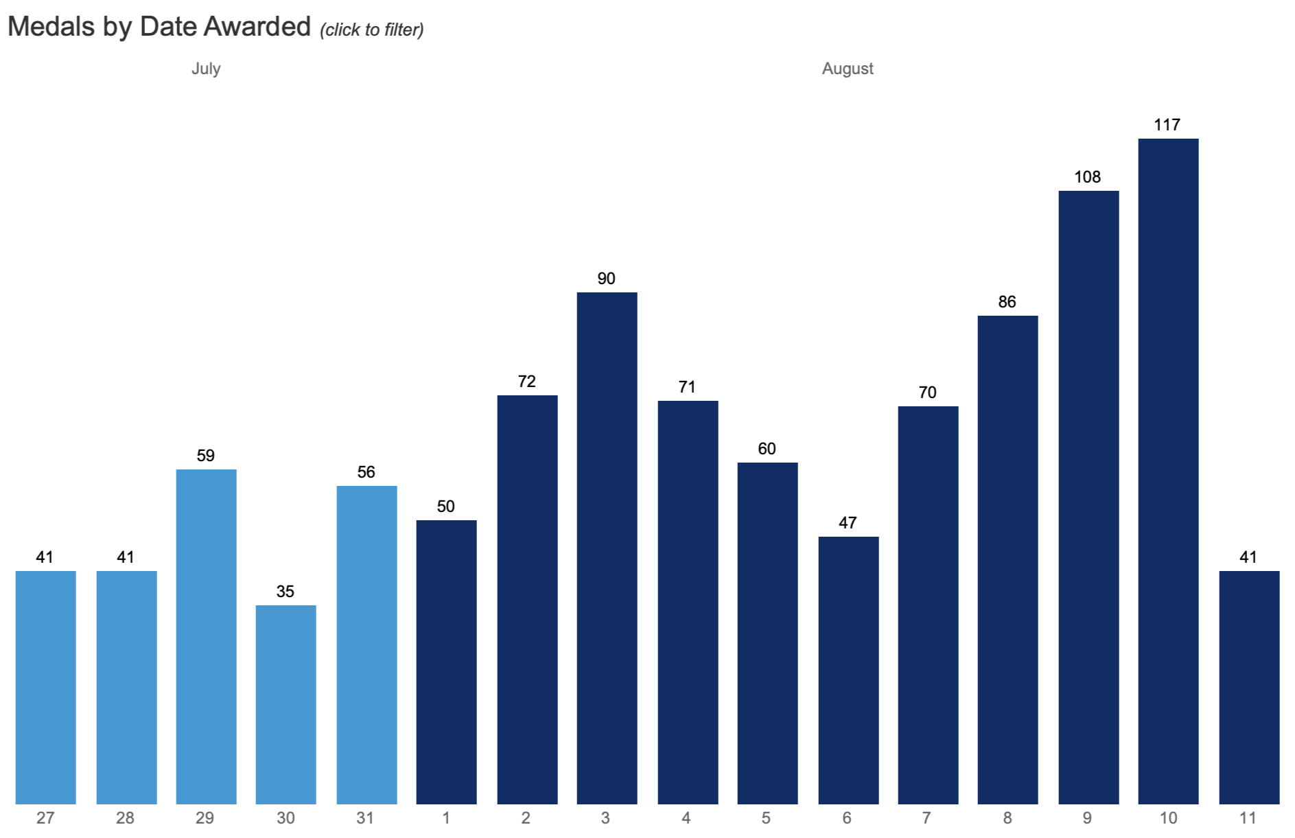
329 different events occurred between the dates of July 26 - August 11
This was the first Olympic Games to achieve gender parity
10,000+ athletes participated in the 2024 Paris Olympics
This background encouraged exploration of emergent trends in the 2024 Olympic Medal Count as a baseline for this interactive dashboard.
Project Scope


Project Goals
The Data Visualization curriculum emphasized three key learning outcomes for this project:
Apply business-focused data visualization principles to analyze a chosen dataset.
Design an interactive Tableau dashboard that supports clear, intuitive exploration.
Craft a coherent data story using linked views, hierarchy, and visual encoding techniques.
Project Outcome
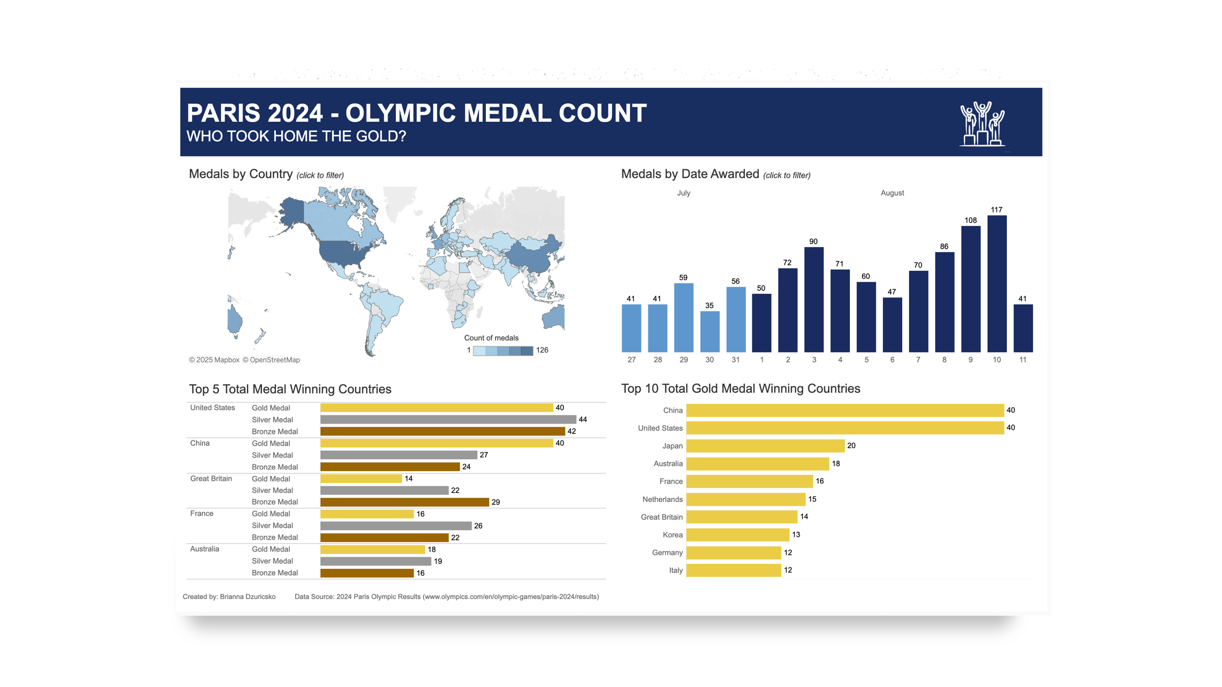
The project resulted in an interactive Tableau dashboard that highlights top medal-winning countries from the most recent Olympic cycle. The dashboard integrates linked filters, a structured narrative flow, and refined visual encodings to present a clear, engaging story.
Process Overview
DATA PREPARATION
Data Location
Data Cleaning
EXPLORATORY ANALYSIS
Analysis in Microsoft Excel
VISUALIZATION PLANNING
Creating Graphs and Charts
DASHBOARD DEVELOPMENT
Connecting Graphs and Charts
Finalizing Dashboard
DATA PREPARATION
Locating Olympic Medal Data & Cleaning for Tableau
To establish a reliable foundation for analysis, I copied the official 2024 Olympic medal data directly from the Olympics website into Excel.
Once imported, I cleaned and reformatted the dataset to ensure it was structured appropriately for Tableau by standardizing column labels, correcting formatting inconsistencies, and organizing medal counts so they could be accurately recognized and parsed by the software.
This preparation step ensured the data was both clean and analysis-ready, enabling a smooth transition into deeper exploration and visualization.

Identifying Medal Count Patterns & Insights
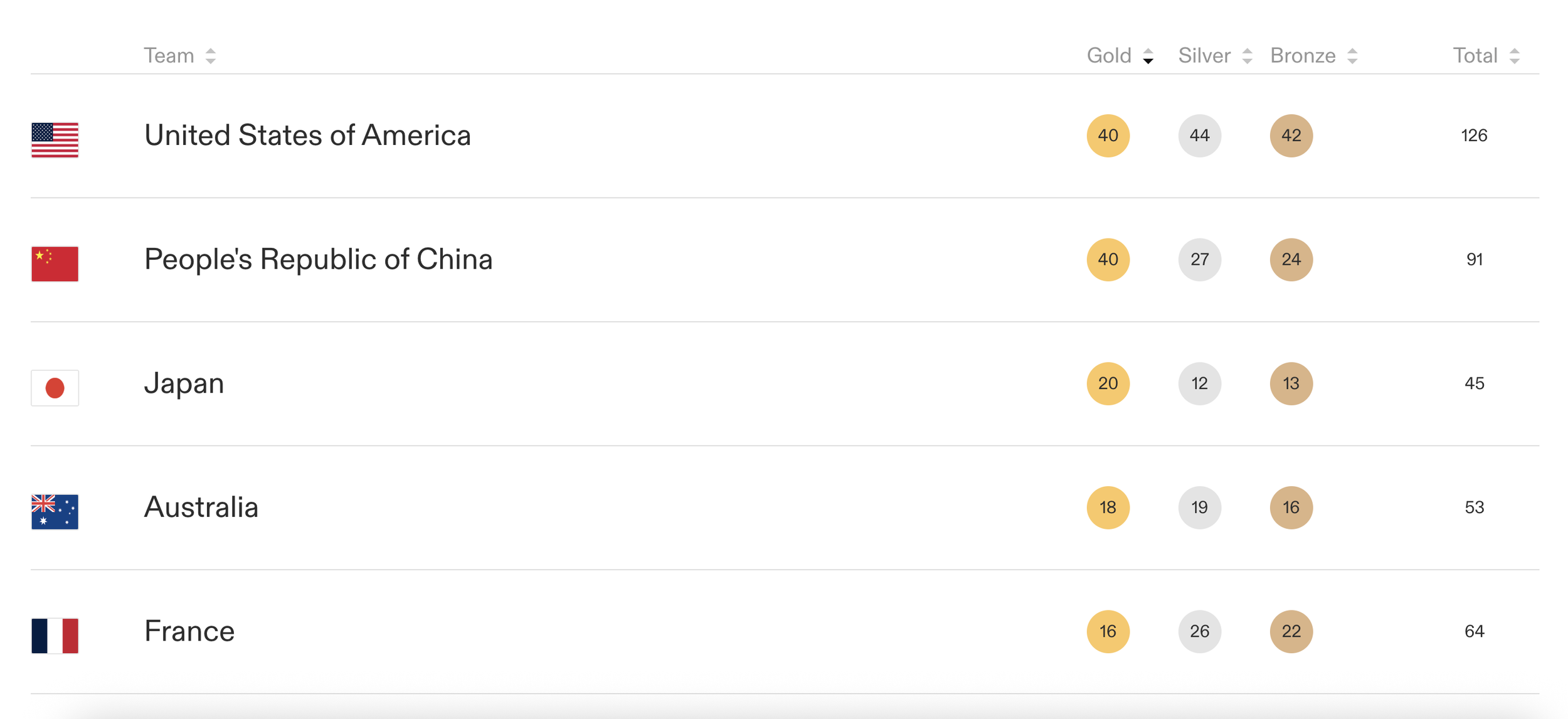
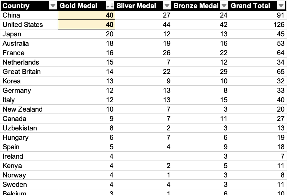
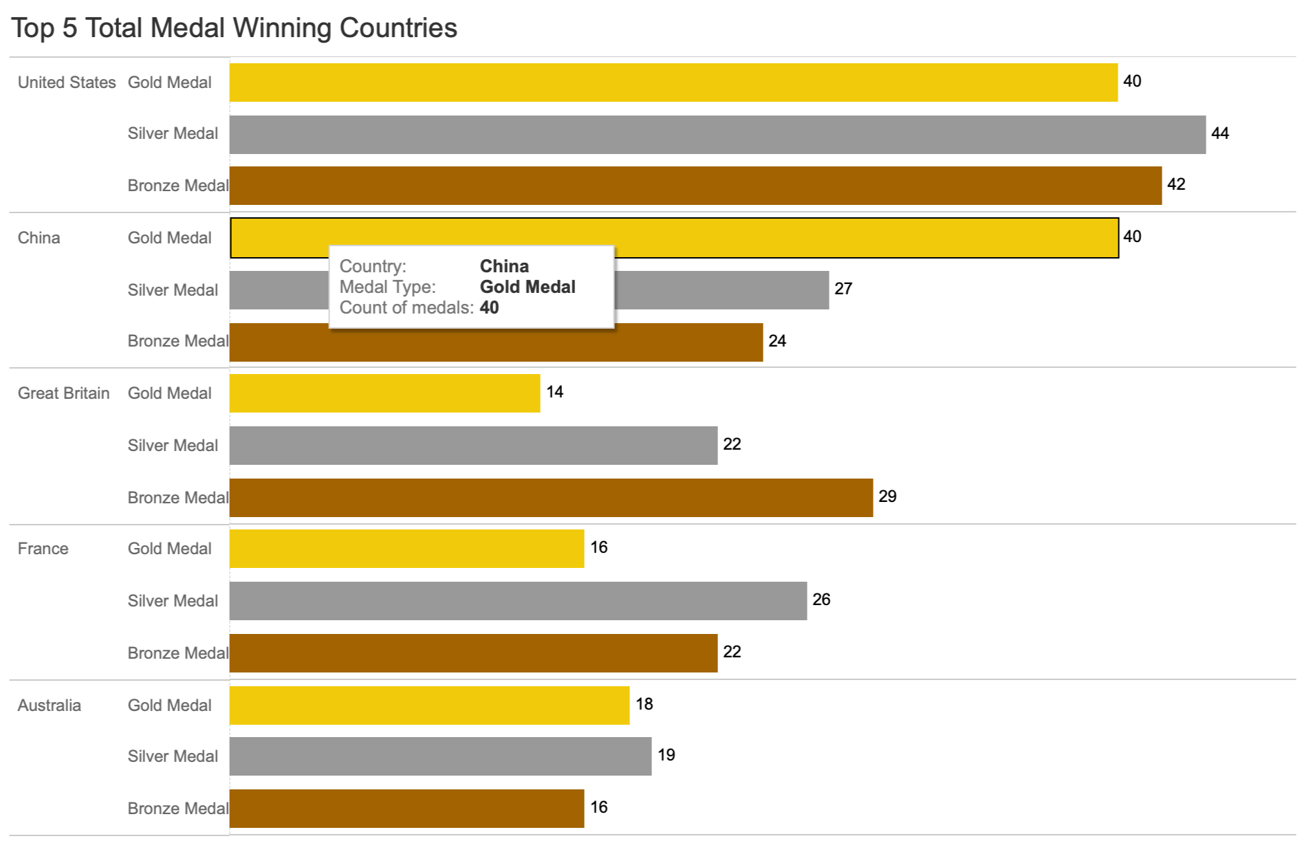
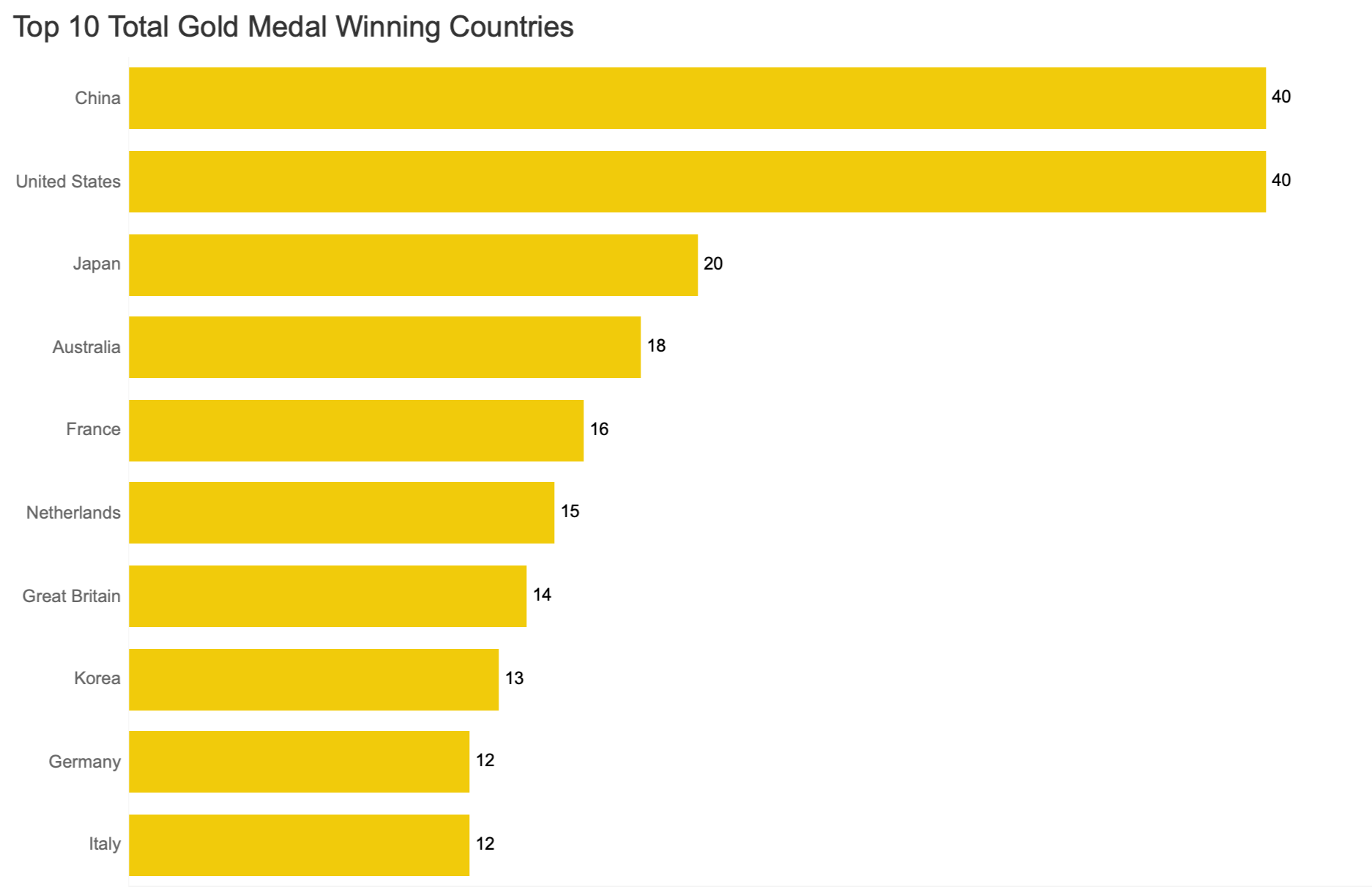
Once the dataset was cleaned and ready to use, I began exploring the medal counts to identify patterns worth visualizing. During this review, I immediately noticed that two countries held the same number of gold medals for this Olympic cycle, which sparked my interest in comparing overall performance more closely. This early insight encouraged me to dig deeper into how medal totals, rankings, and distribution differed across nations, helping clarify which story would be most meaningful to highlight in the final dashboard.
EXPLORATORY ANALYSIS
Creating Charts & Graphs in Tableau
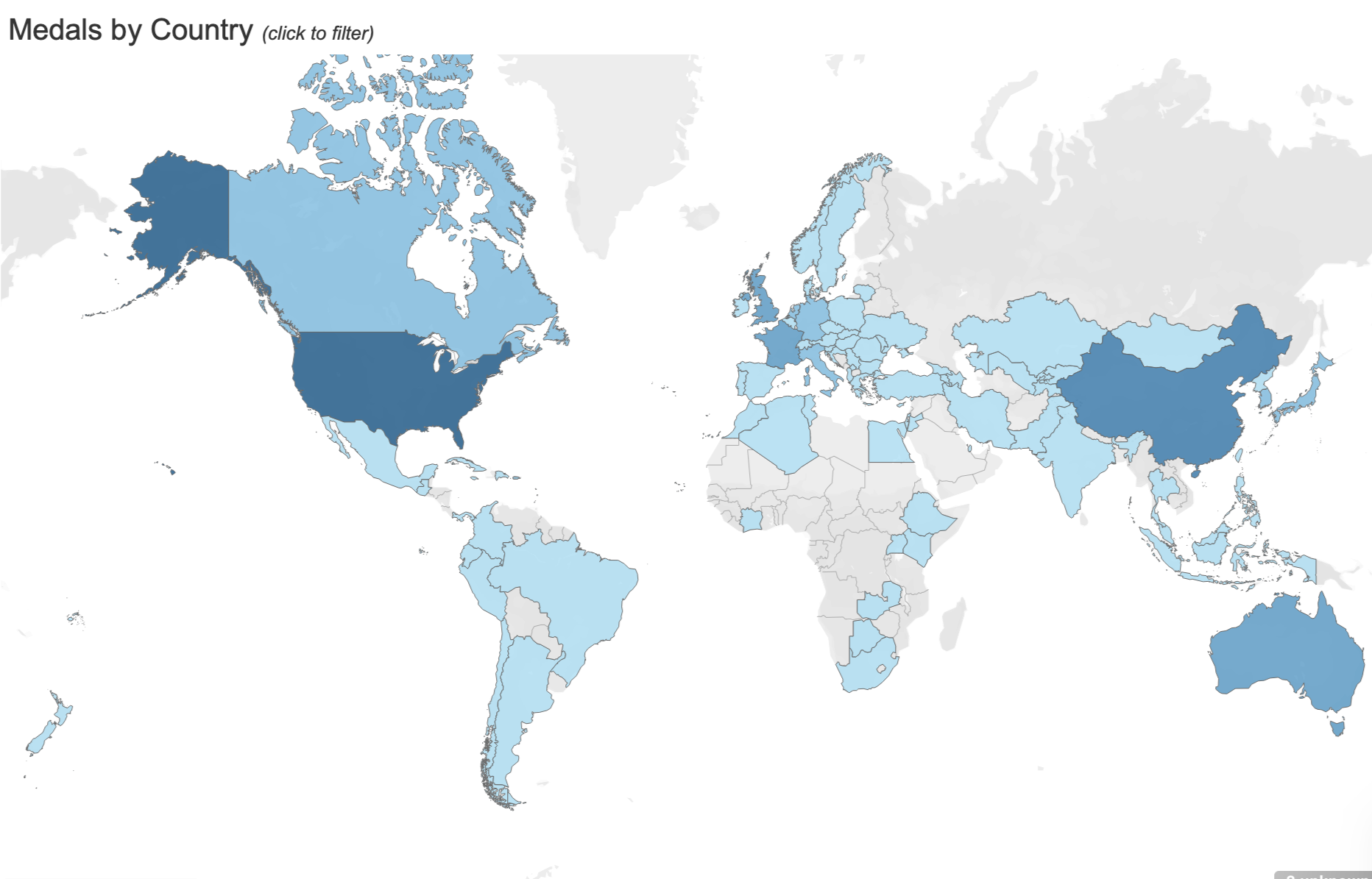
With preliminary insights identified, I shifted into visualization planning by experimenting with different chart types in Tableau to see which formats best highlighted the patterns in the data. This stage involved tinkering with bar charts, maps, and comparative views to explore additional dimensions of the dataset, including geographic patterns, total medal counts, and distributions across gold, silver, and bronze. Trying out multiple visual approaches helped clarify which elements supported the emerging story and which interactions would make the dashboard easiest to understand and explore.
VISUALIZATION PLANNING

Bringing the Charts, Graphs, & Insights together
Building on the visual directions established during planning, I developed an interactive Tableau dashboard that brought the analysis to life. This stage involved refining chart selections, establishing a clear visual hierarchy, and linking views so users could seamlessly move between medal types, countries, and geographic patterns. I adjusted layouts, filters, and color choices to ensure the dashboard told a cohesive story while still supporting open exploration of the medal count of different countries.
The final result is an interactive experience that highlights top performers and allows users to dig deeper into the dynamics of the 2024 Olympic medal results.
DASHBOARD DEVELOPMENT